I wanted to talk a bit about the overall design of No Art Speak, a film, photo essay magazine which I (Ethan Scotney / Magni Studio) both co-founded and designed. Whilst not trained in graphic design, I chose architecture instead and immersed myself in the graphic design field to improve my project presentations with the help of my friends, who are actual graphic designers. Shout out to Eden for inspiring me throughout our time studying together at UoN. I’ve picked up a lot of knowledge and skills in both print and web/digital design, slowly finding my voice in graphics and adapting to the task.
The design language for N.A.S. is quite simple, no ‘art speak’ required. The overall design language echoes our messaging; we’re not going to dumb things down, but we won’t overcomplicate either. Treating the readers as the thoughtful people they are and spreading the art of photography and the powerful cultural messaging it’s capable of.
Logo Design
I’ll start with the biggest hurdle of this design learning experience: the logo. I wanted something clean, simple, but different from the typographic logos I see now. I’ve always enjoyed the clean lines and creativity of graffiti tags, which speak to the magazine’s street photography roots without pushing it too far in that direction. A more refined oval was both a fun and cleaner choice after a few different attempts at digitally writing something myself. Then came the tricky part: setting up guides and experimenting with slight adjustments, overlapping the ovals to generate rough lettering in Affinity Designer (no Adobe here!).
Colour Choice
The green was chosen for its energetic nature and associations with newness, youth, and freshness, which align with what I want to deliver through the visual language of N.A.S. It’s also an absolute favourite of both Paul and me.
Fonts

RGB HEX #15A54E
CMYK 82, 7, 98, 0
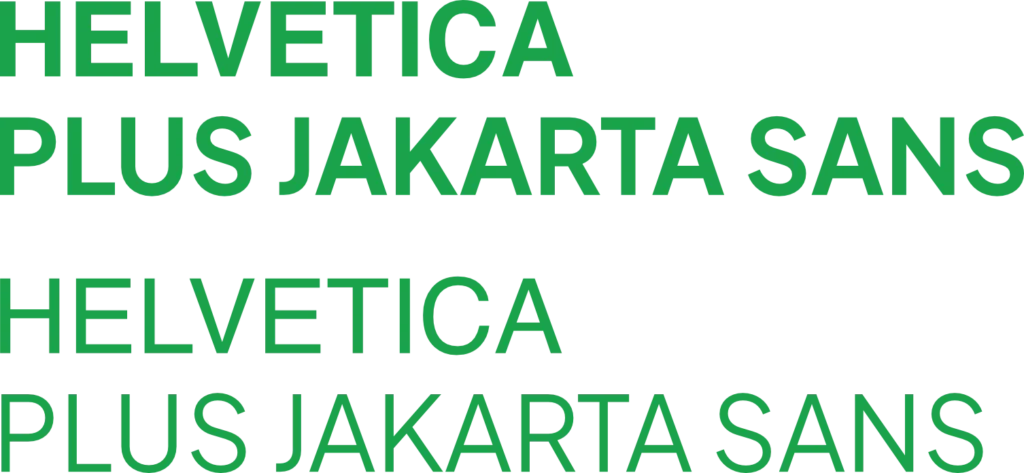
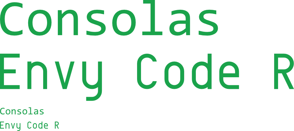
For the fonts used, I wanted to keep it muted but have some difference and handmade-ness. As a bit of a computer nerd, I’ve always been a fan of monospaced fonts for their slightly futuristic nature and their easy readability at smaller sizes. After much searching, I found an open font called ‘Envy Code R’ For headings. However, I also chose the open font, ‘Plus Jakarta Sans’. It’s slightly slimmer and livelier than Helvetica, and on a more personal level, Plus Jakarta Sans reminds me of my partner Raina, who is from Jakarta.
There’s more design to get into, especially when we get deeper into the design language and development of our first issue, ‘The City Weeps’, so stay tuned for that. I’m really excited to tell you all about it.
Check out the No Art Speak Website below!